Herbsmith
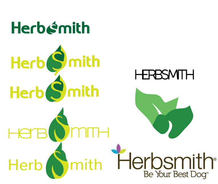
Product Design and Logo
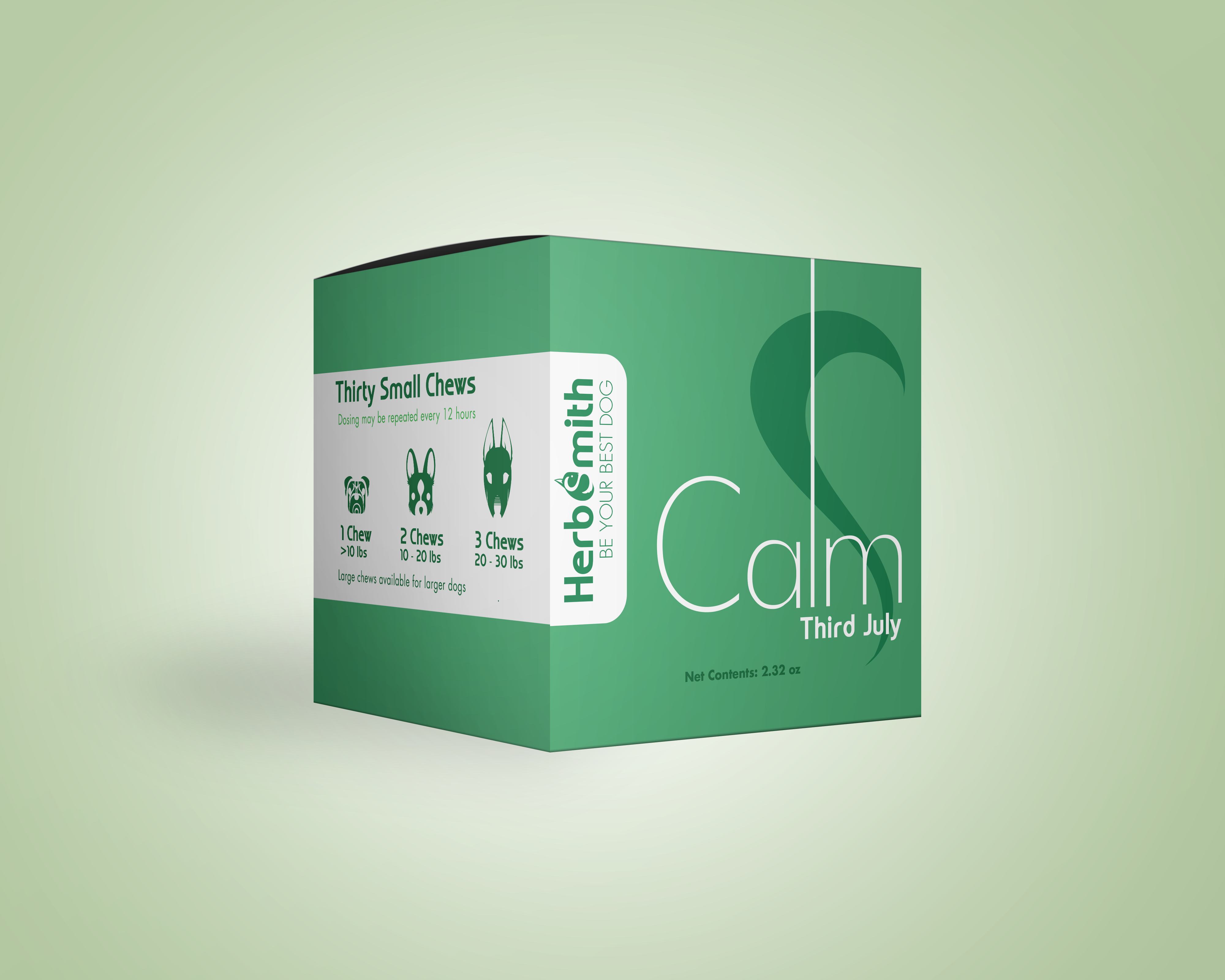
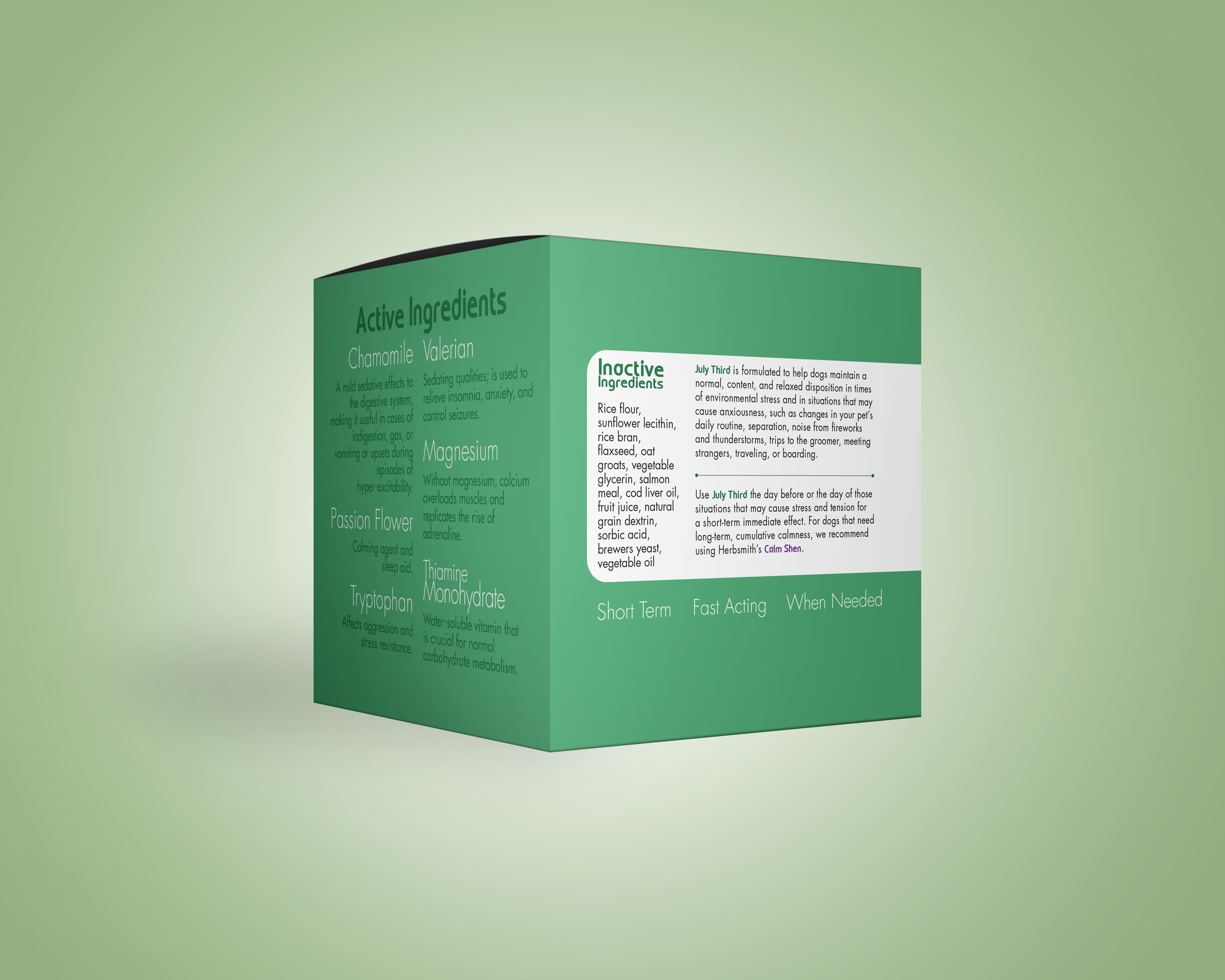
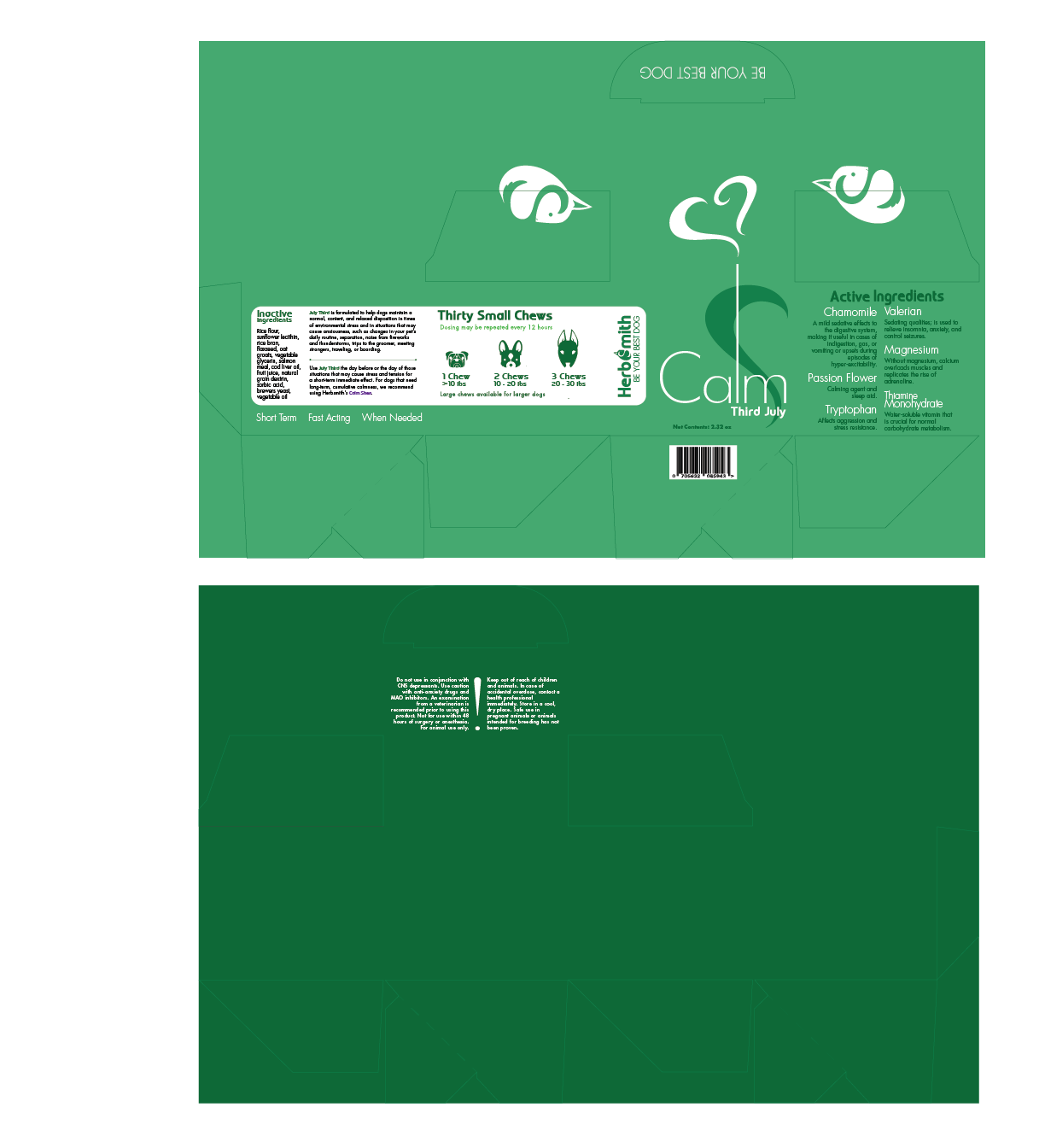
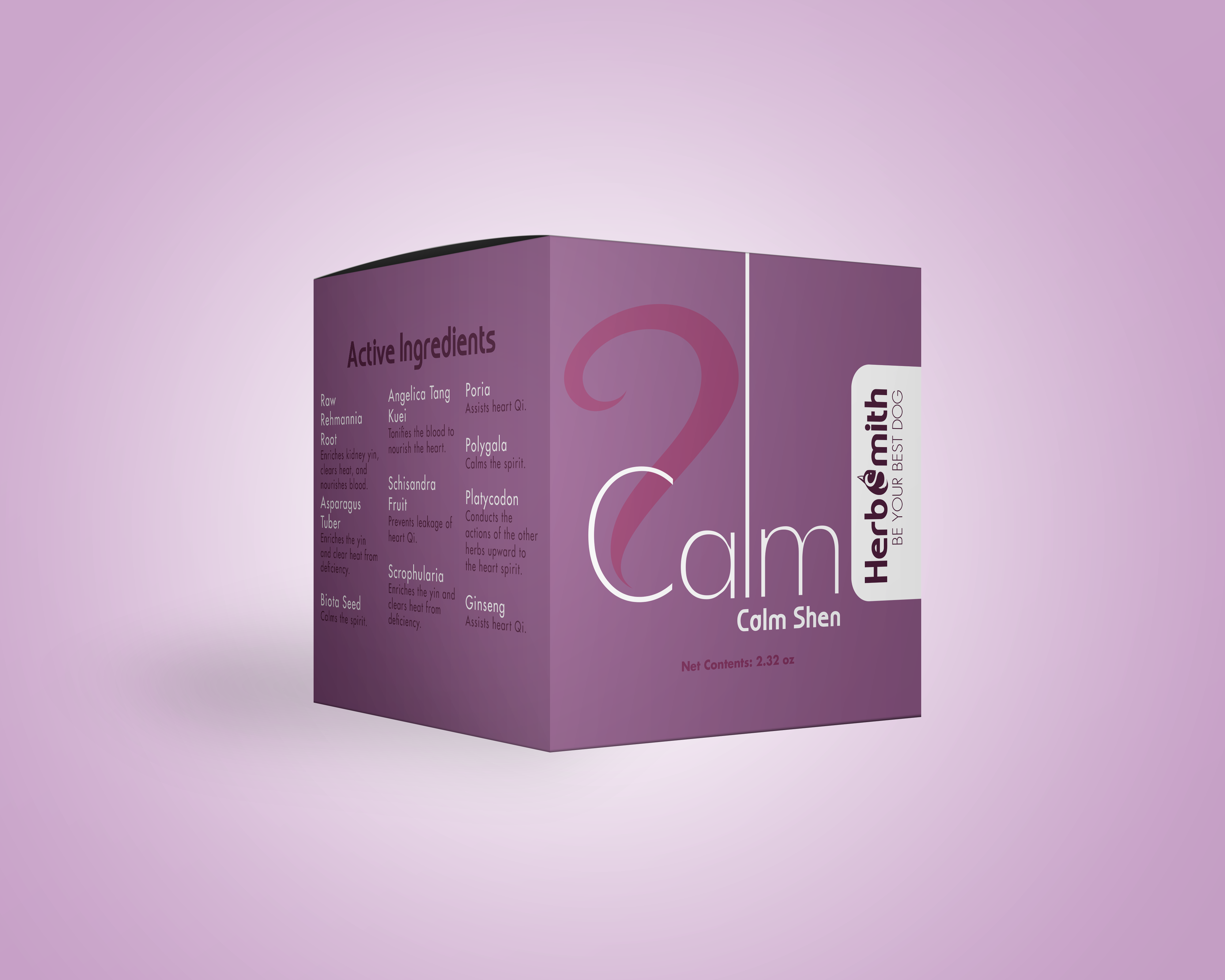
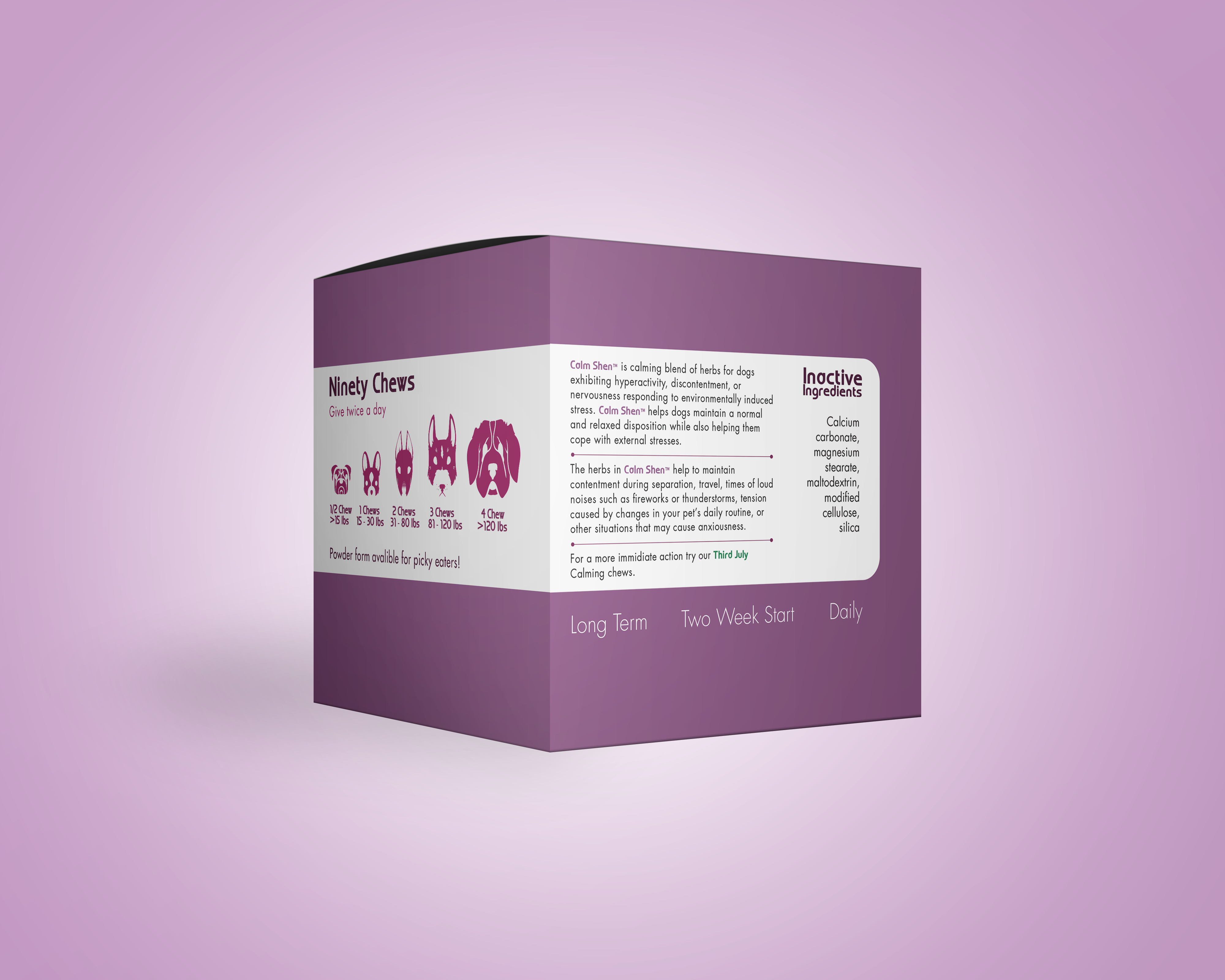
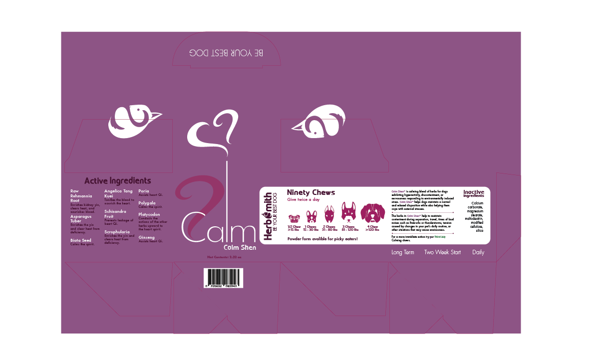
This product is already available on the market as a natural remedy for addressing common pet ailments. I wanted to make a package redesign that would reflect the holistic approach, sharing a modern design and calming identity. To achieve a holistic imagery, I wanted the L in Calm to mimic an incense candle. Another subtle trait is the hearts on the edge of the boxes. When these boxes are put next to each other on a shelf, they would make a heart, implying they complement each other. The goal is that the interactive design would attract the eye of customers and increase the chances of the product being touched and then purchased. Even if the products were not purchased, the branding of the company would still be on the user's mind.
While I learned that I LOVE product design, I did learn from this project that tiny font is not ideal for packaging. I would redo the heart shape as well as the design fails on the product when it's on display alone.