City Rebranding
Logo, Billboard, Website, and Brouture.
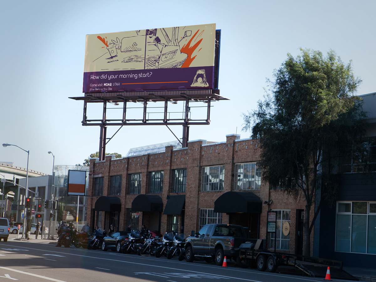
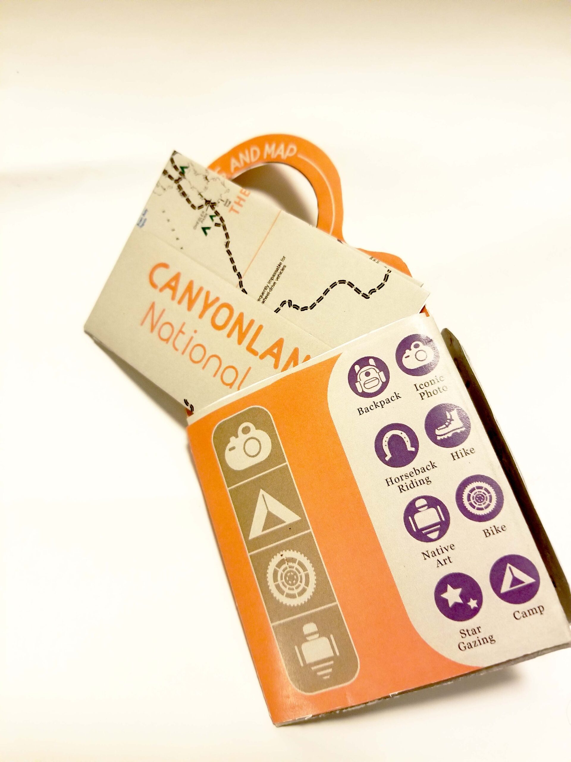
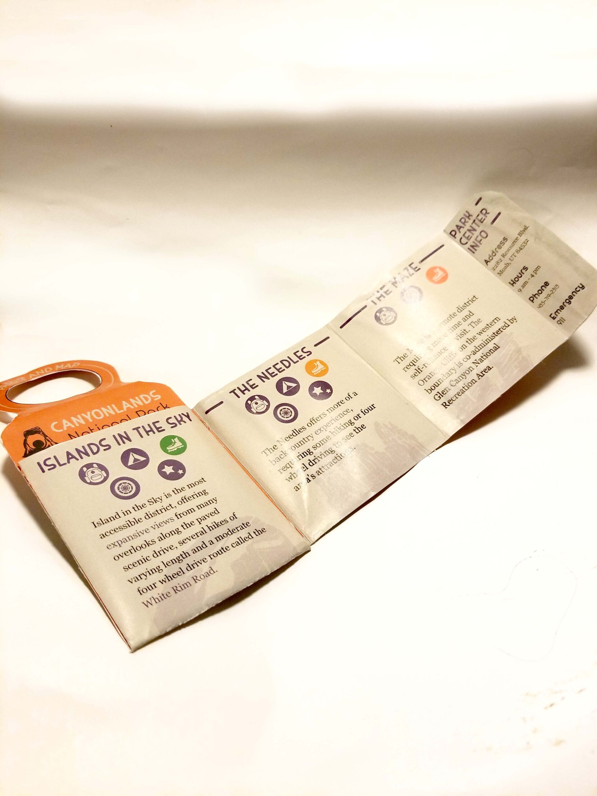
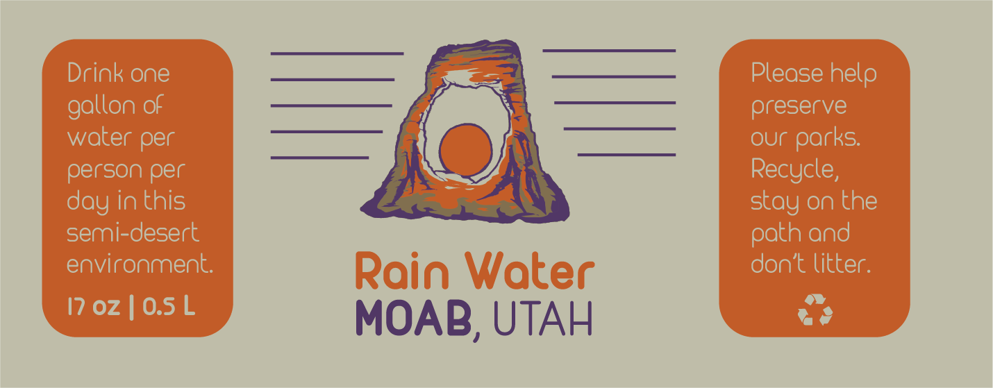
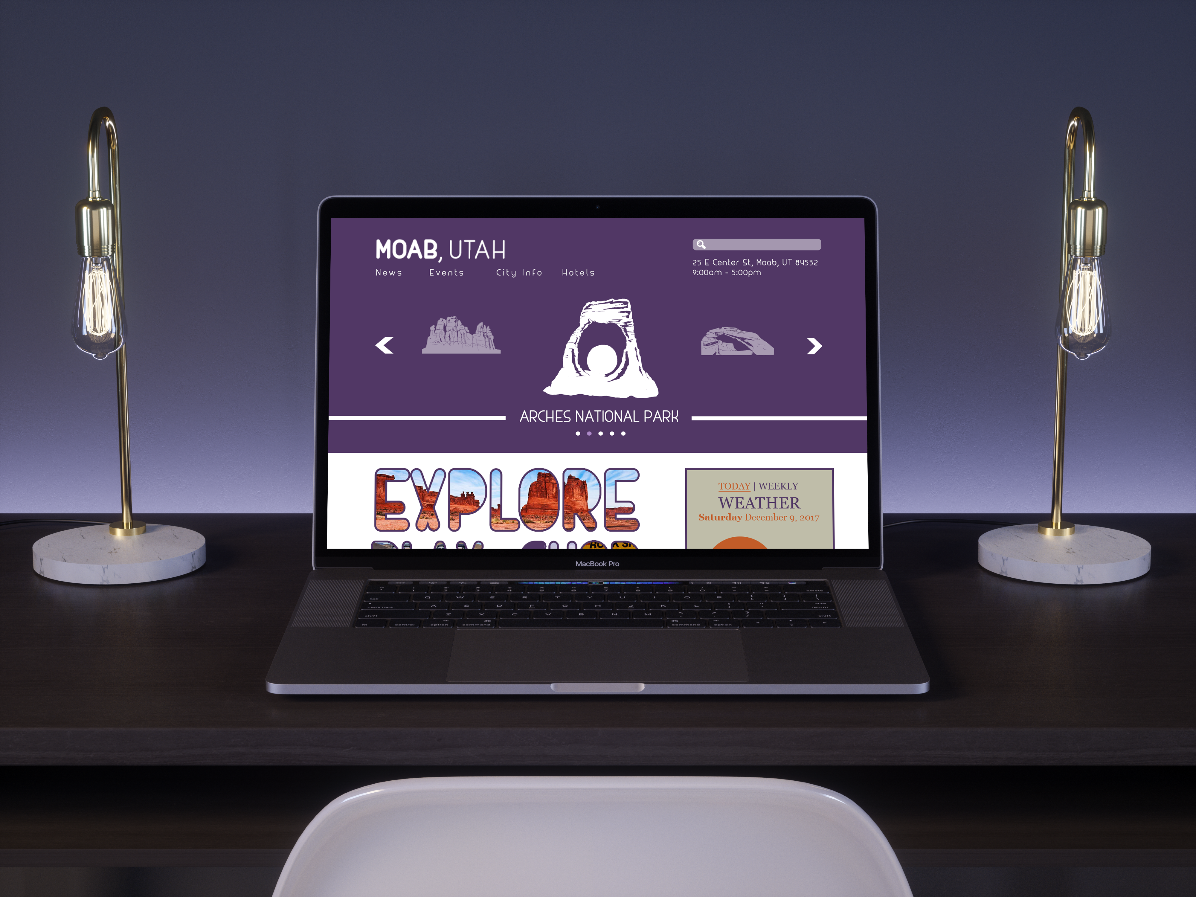
Moab Utah! What an adventure! For someone who doesn't hike much, this place put me in awe and awakened a new side of my senses. I wanted to express the vitality, small-town excitement, and life-changing experiences visually. Color theory was my first task. Purple for luxury because of the small town enmities. Orange for excitement because there is horseback riding, ATVs, river rafting, and so much more. My target audience was hikers, of course. Most national park brochures share the hiking trails, camping spots, and restrooms. Then it gets crinkled in a backpack or folded into a sweaty pocket. I wanted to make it more convenient, so I had it designed to be attached to a water bottle. Next was the marketing to tell users why they should choose Moab. An exciting billboard to make office workers think about their next adventure, and a website that was easy to navigate.